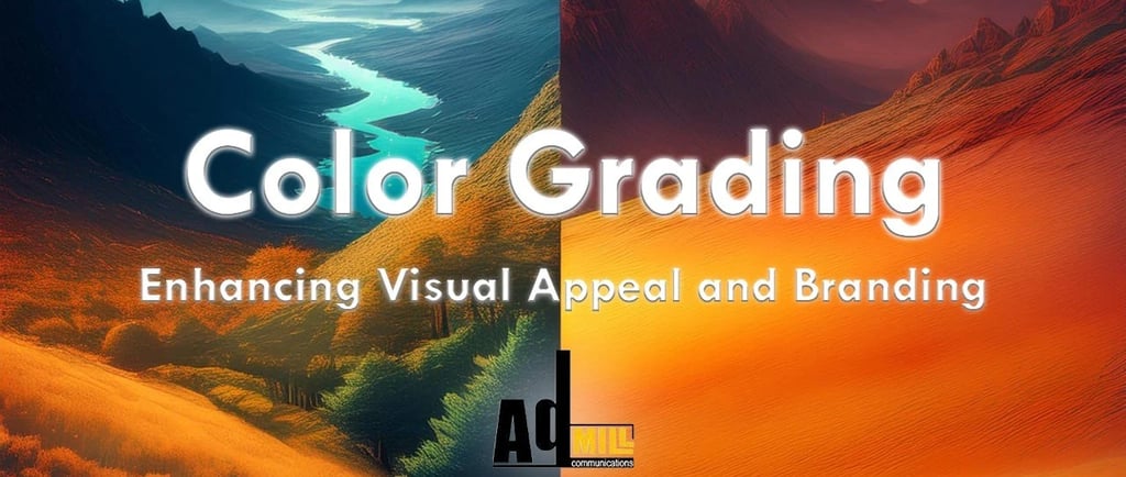
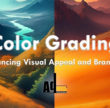
Color Grading: Enhancing Visual Appeal and Brand Identity
In a world where visuals speak louder than words, color grading is the secret sauce that makes your content pop, connect, and convert. This blog dives deep into how color grading enhances visual appeal, sets the mood, evokes emotion, and reinforces brand identity. From the basics and benefits to tools, techniques, and real-world examples like Coca-Cola, discover how to use color grading to stop the scroll, boost engagement, and stay true to your brand. Perfect for marketers, content creators, and video editors looking to level up their visual game.
Abdullah Iqbal
8 min read
In today’s fast-paced digital world, standing out in a sea of content isn’t just a matter of what you say, it's how you show it. Whether you're crafting an emotional brand story or producing a quick product demo, color grading is the magic touch that elevates your visual content from blah to brilliant. It’s not just about making things look pretty (though it does that too!); it’s about creating an experience that resonates with your audience and stays true to your brand's identity. After all, you don't want to be shady with your visuals, do you?
So, let’s dive into the vibrant world of color grading and explore how it can enhance both visual appeal and brand identity!
The Basics of Color Grading
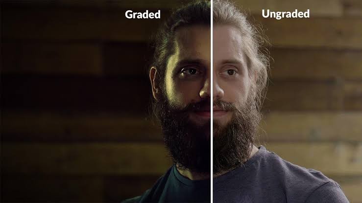
Before we dive too deep, let's set the stage with the basics. Color grading refers to the process of enhancing the color, contrast, and overall look of a video or image to create a specific mood or atmosphere. It’s like the final layer of polish that gives your content its signature shine.
But hold up, what’s the difference between color grading and color correction? Think of color correction as cleaning up after a spill, fixing the exposure, white balance, and saturation issues that make your footage look off. Color grading, on the other hand, is like choosing the perfect outfit for a night out it sets the tone, adds style, and gives your content that unique flair.


Write your text here...To create the perfect visual vibe, marketers and video editors use tools like Adobe Premiere Pro, DaVinci Resolve, and Final Cut Pro. These programs are packed with features to adjust hues, saturations, brightness, and more, ensuring your content goes from meh to marvelous.
How Color Grading Enhances Visual Appeal
Now, let’s get into the real fun, making your content visually irresistible! Color grading can transform a flat, uninspiring video into a captivating visual feast, helping you set the right mood, evoke emotions, and keep viewers glued to the screen. After all, no one wants to watch something that feels a little… washed out, right?
Aesthetic Appeal: Look Good, Feel Good
First impressions are everything, and color grading helps your videos look their absolute best. Whether you're aiming for a bright, happy vibe or a moody, dramatic scene, the right color grading can make all the difference. By adjusting contrast and saturation, you can make your content pop literally turning dull footage into a work of art.
And here’s where color grading gets really cool: it’s a great way to bring out the details that might otherwise go unnoticed. Subtle tweaks in color can highlight elements of your video that reinforce your message, making the experience more immersive and engaging for your audience. It’s like putting on a pair of sunglasses on a bright day everything just looks better.
Creating Emotional Responses: Color Me Impressed
Did you know that colors can stir emotions faster than a cup of coffee on a Monday morning? Yup, it’s true. Different hues trigger different feelings: warm colors like reds and oranges evoke energy and excitement, while cool blues and greens create a sense of calm. Color grading allows you to harness this power and craft a visual experience that connects emotionally with your audience.
Let’s say you’re promoting a fitness brand. You’d probably want to use bold, energetic colors like red and yellow to pump up your viewers and get them excited about your products. On the flip side, if you're marketing a luxury spa, soft blues and muted tones will help create that calming, peaceful vibe. The result? An emotional response that draws your audience in and keeps them engaged.
Setting the Mood: A Graded Experience
Think of color grading as your mood lighting except it’s for your entire video. By adjusting the color scheme, you can instantly shift the mood of your content. Need a suspenseful, thriller-like vibe for a product teaser? Go for deep, dark tones with strong contrast. Want to create a warm, feel-good story for your brand’s anniversary? Choose soft, pastel hues.
For example, just look at films like The Matrix with its cool green tint or Mad Max: Fury Road with its intense orange and teal grading. Those color choices were deliberate to create a specific atmosphere. Now, imagine applying that level of thought to your brand videos. Color grading isn’t just a technical process—it’s a storytelling tool that helps you set the right tone and feel for your brand message.
Improving Viewer Retention: Keeping Them Hooked
Let’s be real—attention spans are shorter than ever, and keeping viewers engaged is harder than getting the last slice of pizza. Fortunately, color grading can help. Well-graded content is more visually appealing, which means it grabs attention and holds it. When your video looks professional and polished, viewers are more likely to stick around, watch the whole thing, and—here’s the kicker—take action.
Color Grading and Brand Identity
Here’s where things get even more exciting—color grading doesn’t just make your content look good; it also plays a crucial role in maintaining and enhancing your brand identity. Think of your brand as having its own color DNA—a unique palette that communicates who you are and what you stand for. When done right, color grading ensures your content stays true to that identity across all platforms.
Consistency in Brand Colors: Staying True to Your Hue
One of the biggest benefits of color grading is the ability to maintain consistent colors across all your marketing materials. Let’s say your brand uses a specific shade of blue in its logo, website, and social media. With professional color grading, you can make sure that same blue shows up in your videos, keeping your brand’s look cohesive.
This consistency is key to building brand recognition. When people see your color scheme popping up on their screen, they’ll instantly know it’s you. It’s like your brand’s visual signature.
Building Emotional Connections: More Than Just a Pretty Picture
Color isn’t just about aesthetics it’s also about making an emotional connection with your audience. A brand with a playful, energetic identity might lean toward vibrant, saturated colors, while a luxury brand might opt for more muted, elegant tones. The right color grading can enhance these emotional cues, making it easier for your audience to connect with your brand on a deeper level.
Aligning Color Grading with Brand Guidelines: Grading to Greatness
If you’ve ever worked on a marketing campaign, you know how important brand guidelines are. From fonts to colors, everything needs to stay on-brand. Color grading is no exception. A well-executed color grading process aligns with your brand’s existing color palette, ensuring your videos feel cohesive with your other marketing materials.
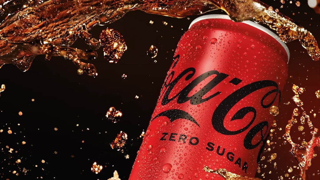
Case Study: Coca-Cola A Masterclass in Red
A great example of color grading in action is Coca-Cola. Their brand is synonymous with vibrant reds, and they make sure that color is present in every piece of content they produce. From commercials to social media videos, you’ll notice that Coca-Cola's signature red always takes center stage, creating a sense of brand consistency and recognition. That’s the power of using color grading to reinforce your brand identity!
The Role of Color Grading in Modern Marketing Campaigns
Now that we’ve covered the basics, let’s talk about how color grading plays a pivotal role in today’s marketing efforts.
Video Ads: Lights, Camera, Color!
In a world where video is king, color grading is the crown jewel. From short Instagram ads to long-form YouTube content, the right color grading can elevate your video ads, making them more visually appealing and effective at driving engagement. Whether you’re promoting a product or telling a brand story, color grading ensures your message comes through in vivid, impactful detail.
Social Media Content: Stop the Scroll!
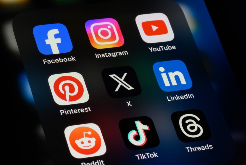
Social media is a fast-paced environment where visuals need to catch attention immediately. Color grading helps your content stand out in the sea of posts and keeps viewers engaged long enough to absorb your message. With platforms like Instagram, TikTok, and YouTube emphasizing short-form video, you only have a few seconds to make an impact and color grading can make all the difference.
Influencer Collaborations: Staying On-Brand
When partnering with influencers, it’s important that their content aligns with your brand’s identity. Color grading can help ensure their videos match your visual style, even if they’re creating content independently. By providing influencers with branded LUTs (Look-Up Tables), you can maintain consistency without sacrificing creativity.
Color Grading Techniques for Branding Success
Here are some color grading techniques that can help you nail the perfect brand aesthetic:
Match Tone to Audience Expectations: Tailor your color grading to your target audience. For example, use bright, playful colors for a younger audience and muted, sophisticated tones for a more mature demographic.
Use of Filters and LUTs: These handy tools help maintain color consistency across multiple videos, ensuring your brand’s visual identity stays intact.
Custom Color Profiles: Developing custom color profiles aligned with your brand ensures a consistent, recognizable look across all your content.
Challenges in Color Grading for Brand Identity
While color grading is a powerful tool, it comes with its own set of challenges:
Maintaining Consistency Across Platforms: Different devices and platforms display colors differently. Ensuring consistent color grading across all formats can be tricky, but it’s essential for maintaining brand integrity.
Balancing Creativity with Brand Guidelines: While creativity is important, it’s crucial not to stray too far from brand guidelines. Finding that balance between artistic flair and brand consistency is key to successful color grading.
Ensuring Accessibility: Make sure your color choices are accessible for all viewers, including those with color blindness. High contrast and clear visual elements can help ensure your content is inclusive.
Tools and Software for Professional Color Grading
To get the best results, it’s important to use the right tools. Here are a few top-tier color grading software programs:
DaVinci Resolve: A powerful, professional-grade tool used by filmmakers and editors alike.
Adobe Premiere Pro: A versatile option with a wide range of color grading features, ideal for marketers and agencies.
Final Cut Pro: Apple’s video editing software offers advanced color grading tools for creating visually stunning content.
Color grading is more than just a finishing touch it’s an essential element of video production that can transform your content and strengthen your brand identity. By investing in professional color grading, you ensure that your visuals not only look amazing but also tell a cohesive, on-brand story that resonates with your audience.
So, whether you’re creating a sleek ad campaign, a social media video, or a brand documentary, don’t let your content look half-baked. Make it pop with some professional color grading, and watch your brand shine brighter than ever!